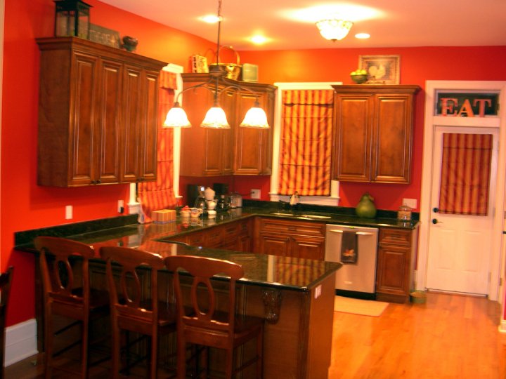
Oh my goodness girlfriends, you sure do know how to respond to a paint S.O.S.! I am overwhelmed…literally…by the response :). I also feel a bit bad for my kitchen. I feel like I betrayed her somehow. Don’t get me wrong, the red has to go, but I should have at least posted a decent photo of her. So the picture above was taken about 30 minutes ago. And yes, all of the clutter that was on the counter was scooped onto the floor behind the bar and the sink is hiding dinner dishes. Just keeping it real here. If someone is wondering what shade is on those bright walls it is Benjamin Moore’s Million Dollar Red. Actually, it really is a great color and would look fantastic with white cabinets. It’s just not working here.
Okay, now onto other colors. In reading all of your comments (and yes I read every single one, you should know I always do) you guys suggested greens, golds, blues, grays, and tans. I went on my Benjamin Moore Color Viewer program (oops, I forgot I even had this) and tried some colors on for size. The problem with this program is that nothing is even close to the swatch. You can’t trust it. But it does help give you an overall picture. So take a look and let me know what you think now.
1. Weston Flax

2. Tyler Taupe
3. Great Barrington Green
4. Bryant Gold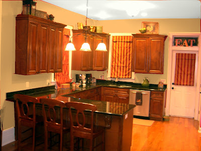
5. Brunswick Beige
6. Bennington Gray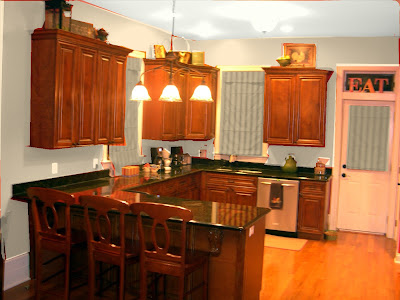
7. Ashely Gray
8. Blue ? You guys are the best!!!
I like the Bryant Gold or Blue out of these choices.
The Barrington Green does it for me. It's the perfect color to offset your cabinets and really showcase them to their fullest.
I'm probably too late but I like the Taupe one best!
I like the gold and also think a richer beige would work well too. I would change the window treatments to a natural material shade (like bamboo) and switch the hanging light to something more contemporary (like a Seascape light). I think this would give you a clean, fresh update. Good luck!
I love #4–the gold. It warms up the room and makes it feel comfortable and inviting. I can't wait to see what you choose!!
I am not sure if you've painted your kitchen walls yet, but if not…please consider Tyler Taupe! It looks so beautiful against your cabinets and flooring. It is a nice neutral color that will bring warmth yet be a backdrop for lots of different decorating options.
Good luck!
Tyler Taupe (2) was my favorite of all of the examples, it really brightens up the cabinetry and counter top!
I think an orange wall color will really bring out the gorgeous color in the cabinetry and countertops. Take a look at the following in the Affinity collection (in either eggshell or washable flat).
Masada – AF220
Firenze – AF-225
Buttered Yam AF-230
Wwarmed cognac – AF-235
Good Luck with your decision!
As a Benjamin Moore color consultant, I would lean toward caramel colors like Camel back 1103. Blues and grays are not appetite inducing for a kitchen. Save those for bedrooms and powder rooms. The green granite is very strong so you need to balance that with the same intensity on the wall. Good luck with your project!
I happen to like the red. I think it makes the room look bigger and ties the counter top in with the cabinets without a back splash. I think if you go with any of the other more subtle colours you ought to consider tiling or the sort.
Love the green….
Kathy 🙂
Here's one more opinion; the Barrington Green, because with all the other lighter colors, your countertops stand out too much. The Barrington Green tones it down and they don't stick out like a sore thumb. Have you thought about painting your cabinets?
I am a fan of the Bryant Gold. I have been painting like crazy lately! Good Luck with your project, I am sure it will turn out great! P.S. I think some wood blinds would look really nice!
Hey, Beth, I'm late to the party, but I can't wait to see your newly painted kitchen. I had a red dining room & changed it in the spring & I love, love my newer lighter look. You will too! I do think a light gold will look great and actually, one of those blue/grays looked pretty good too, but you'll need to find what looks best with your wood color. It's going to look fab!!
I'm partial to the bryant gold, but that's because it looks similar to the color in my kitchen, and I have the same kind of dark cabinets. Good luck!
I've sat back and read all of the comments on this topic, and have remained silent as to my opinion so far (not that mine is the be all, end all). I'm going to go in a whole different direction with my opinion than the other hundred or so responses you've gotten on this topic. I think that more than "what color works with your cabinets and counters" – the more important issue is what color works with the rest of the paint in the area. Your first floor is as open a concept as in humanly possible. From what I read, you just want to paint the kitchen, not everything. So, what color is the rest of the space? You're sick of the red – that's cool. But what's your plan for this space – do you want it to blend in with everything else, or do you want the kitchen to remain a defined space? I think you need to decide THAT before you decide if you want to go with another neutral (like the rest of the floor), or something in contrast? I don't see you as a "blend in" kinda girl, but then if you're sick of the red, maybe that's what you're looking for right now. But once you've decided that, then that will tell you if a "beige" is even a possibility for you.
Good luck – we're not painting our place till after Christmas.
go with warm green!!
go with warm green!!
We can't wait to see which color you choose. Good Luck with your kitchen.
SPUN SUGAR by Martha Stewart is a LOVELY shade of gold. It's what I painted in my art niches and the backdrop for several of my photos. I can email you a pic if you want, just let me know. Good luck!
I love the bryant gold!!! It really pops!
Right now I'm liking #2 (taupe) and #3 (green)
I really like the taupe. It gives such a neutral look that you can change out your accents (drapes, pictures, towels) so easily! You're not over commited!!! Hope you find the perfect fit for your beautiful kitchen!
Tyler Taupe or barrington green. But Tyler Taupe is my #1 choice. Can't wait to see the finished product.
There are a lot of beautiful colors, but I like the Bryant Gold the best with both the cabinets and countertops.
I say 2,4 or 5. They're neutral enough to let the cabinets steal the spotlight but dark enough that the cabinets aren't floating out there by themselves.
So exciting!!
That Bennington gray is gorgeous!
I like #2,3,and 4. They really add a nice comfortable feeling to the kitchen. Like 'Ah, I'm home'.
My votes are #2,4 or 5. 😀
I like the green or gray! I just found your place! I love it! Such great creative and fun inspiration. Have a great weekend!
I LOVE THE TYLER TAUPE!!! GORGEOUS!!
I love the gold.
I need to check out that program. I could spend hours trying different colors like this! How fun.
I thought blue would be interesting in there until I saw the examples. Now I'm leaning toward the golds and taupes. Maybe the green. They make your cabinets and counters look really expensive and rich.
I know what you mean about the red–I love it in other peoples' houses, so I tried it in mine. It was hard for me to live with, though. My friends were scandalized when I painted over it again a couple years later because they loved the red. I needed more neutral walls, though.
I like the tyler taupe…think the green and blues clash with the count top.. best of luck picking. I usually go to the store and pick up the cards with the colors on the. I will get two or three of each color I like, take them home and tape them together (to get a larger feel of it) and leave them up for a few days…looking at them in different lights of the day and studing them as I go into the room..this usually helps me.
Check out Sherwin Williams Wheat Grass and/or Edgy Gold (Same color – only darker on the color swatch). My dining room is Wheat Grass. You can see a nursery decorated in Wheat Grass on Design Dazzle latest post and on my blog – first or second ever post.
littlelizardking.blogspot.com
I love the gold also. I mentioned a Behr gold color yesterday, so to actually, kinda sorta, see it on the walls made my conviction even stronger. I feel the cooler colors are great for bedrooms and bathrooms, but not for a kitchen. You could also do a lot of black accents with that too. I know that you are really trying to get it right the first time, but I agree with another poster that you will probably need to get a few samples and paint them on your walls. I painted my kitchen and dining 5 times with shades of tan/brown until I finally found the perfect one for our house. (Of course, now that you have offered up your red, I am beginning to reconsider!) Again, good luck.
I say gold. That looks great! I've been out of pocket lately and love your post about the coastal ornaments. I REALLY want to do that. Thank you for sharing!
Love the Tyler Taupe!
With the green countertops, the taupe looks best in the photos. What are you going with??
Well I shut my mouth–you got some great feedback. Can't wait to see what you choose, I know it will be great.
Green isn't typically my color preference, but I really like that one!
bryant gold 🙂
Hmmm…too many choices!!! I still like the blues, but the gold is really pretty. It looks warm and welcoming 🙂
I vote for the gold:) It seems warm and welcoming…brings out the nice colors of cabinets and counters.
I am absolutely loving the taupe and the gold,
I like the gold!!! Go with the gold! Looks very homey!
Love the Bryant Gold . . . it has a nice "warmth" to it!
I wanted to share some pics of the color of my kitchen so I posted them to my blog http://annieroseshouse.blogspot.com/2009/11/color-of-my-kitchen.html I think for some reason your kitchen reminds me a bit of mine. Good luck painting!
I love your kitchen. I like numbers 2, 4 and 8.
I like Great Barrington Green or Bryant Gold the best.
I think I like the greens the best. The EAT in your transom (?) is so fantastic! The kitchen has great bones!
You have a beautiful kitchen so I am sure any color you choose will be great! I love the Tyler Taupe 🙂
Number 2 for sure! 🙂
Hands down, #4 and #5. Was that Bryant Gold and Barrington Beige? Some of those other colors just enhanced the green in your countertop, and I got the impression that isn't what you want. PLUS, they are better colors for the backsplash you'll be getting. 🙂
I am loving the taupe. With the "colors" green, blue, ect. I have found for me I get tired. If you stay neutral you can use those colors to decorate with and not be stuck. Can't wait to see what you choose?
Green or Taupe !
I'm drawn to the Barrington Green and the Bryant Gold in these examples. You're probably going to have to paint some samples and hold or prop them against the wall to get a better idea in person {once you narrow it down a bit}. After your last post, I'm surprised you're not totally confused now! : )
I used BM Audobon Russet with my maple cabinets and dark granite and it worked! That was after trying cream, beiges, yellows and blue!really! You can see it here-http://nan-livelovelaugh.blogspot.com/2009/09/kitchen-redo.html. I do like the tyler taupe and I used SW Restrained Gold (like Tobacco Rd.) in my den and LOVE it. Blonde is nice, too!
~Nancy
I'm loving the green!!
I like the Barrington Green…it really makes the cabinets and counter pop !
I don't think any of them do your kitchen justice, but my first choice would be the tyler taupe and then the barrington green.
Debbie
bryant gold would look fabulous..also like the tyler taupe..good luck!
HoW fun! I think I like the Barrington Green, and Brunswick beige the best. I can't wait to see how it turns out.
I like 2 and 4 the best.
Love the gold, has some color, but still a neutral. Looks great with any decor, (I'm partial) It really sets your cabinets, granite and trim off!
Debra
My favorite is the Bryant Gold or the Barrington Green!
But that is just my opinion!
I'm not feeling the blue at all!
I love the Tyler Taupe. The green makes the counters look too green.
Good luck!
I love the green or the gray. With those dark cabinets those colors are my favorite.
I like the brunswick beige or the gold. I'm sure everyone's answers will be just as varied as the initial responses . . . the question is, which one do YOU like?? 🙂
I like the tyler taupe or the great barrington green!