If you follow me on Twitter or if you ever saw my post here, then you know that I have struggled with redecorating my lower level and especially my kitchen. Like struggled BIG time. I have whined and moaned and stressed over what to do with my kitchen for over a year now. Ridiculous really. Well, enough was enough. It was time to just be rid of the red and do something…anything!
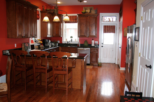
I have had red and yellow in my life for eleven years and am just over it! I tried three different grays on my wall and thought I had found “the one”. But then after living with a patch of “the one” for a month it depressed me. Gray is trendy and I want to be cool and trendy, but I’m just not. Gray was making me feel sad. Sadness is the last thing I need, so I finally decided to just plunge in and and paint the kitchen a neutrally tan. This is what I ended up with.
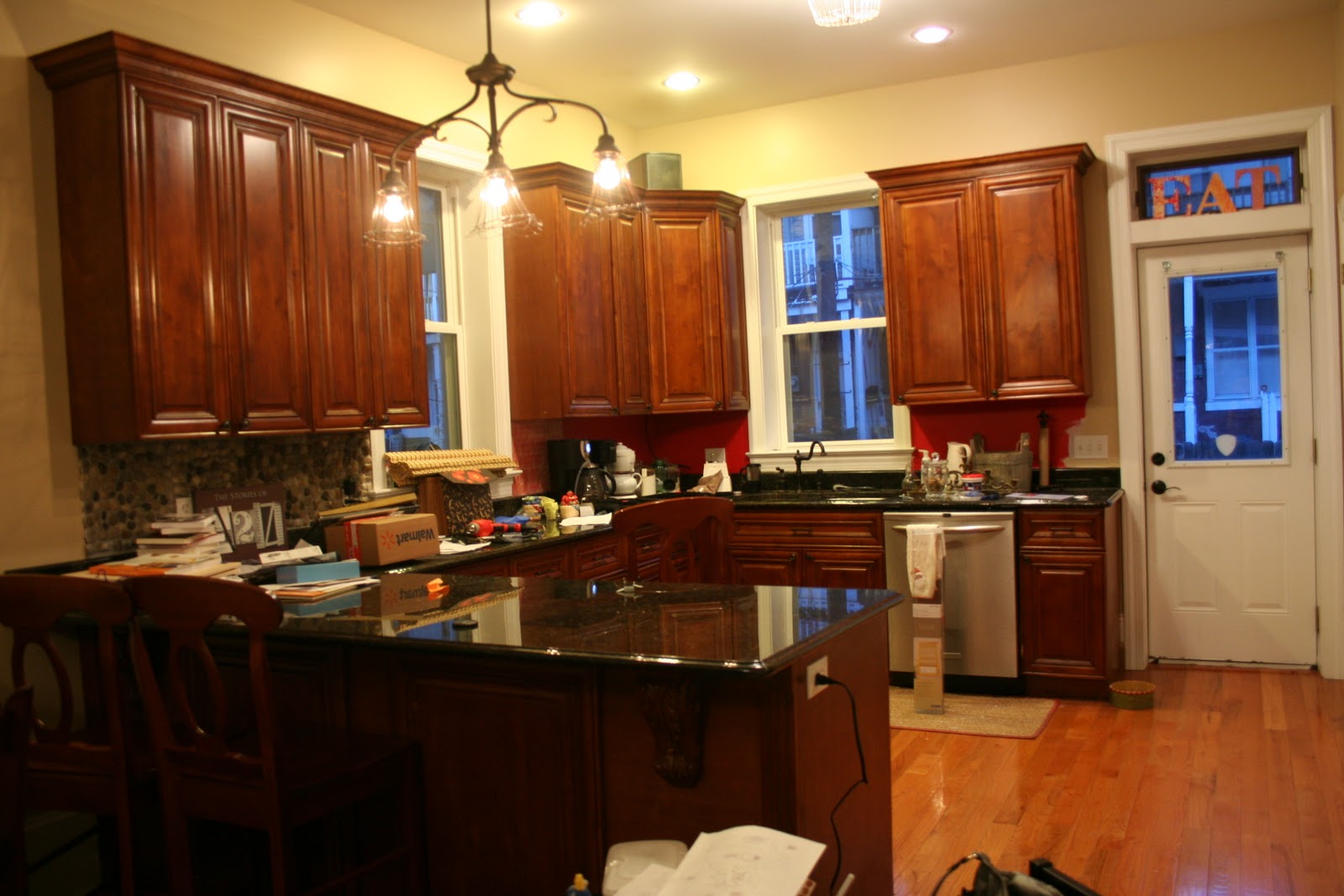
Whaaa??? Wait a minute. Didn’t I say I was over the whole yellow thing? Isn’t that color yellow? And while we’re asking questions here, how in the world did my kitchen get so incredibly cluttered? So, yes. After a year of debating and whining and stressing, I chose a color that was one shade darker than the rest of the yellow in the rest of my house. NO!!!
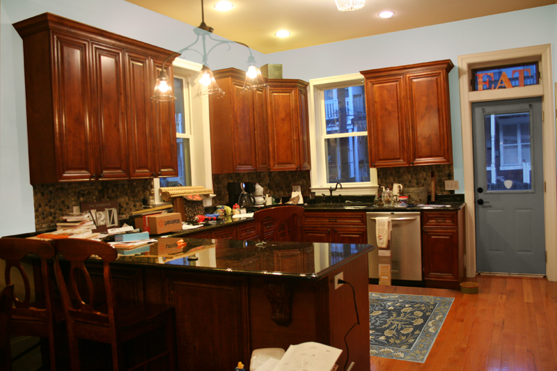
I hit Twitter and begged once again for help. Rhoda, Marianne, Myra, Chris, and Layla came to my rescue! Sea Salt was voted as a potential winner. Layla sent me this mock-up picture with a Sea Salty-esque looking kitchen. Although this color is way more blue than Sea Salt, I was sold on it.
Click the video below to see (sort of) what it looks like. Excuse the mess but whatev. Keepin’ it real peeps! Tomorrow hubs and I are going to start on board and batten. Yikes! Pray for us. I want to still be married at the end of this!
And here are some fabrics that I’ll be using on our lower level for throw pillows and some mistreatments. I also have bamboo blinds going in.

You got the camera from your wishlist than he.
Looking good, my friend looking good. I am off now to the next post to see more of your progress.
Love ye.
Oh not! Treva I already ordered them all. But I just ordered a yard of each. I knew it was a risk but I was feeling impulsive. Sigh. Live and learn I guess.
Love your fabric choices, as I actually ordered three of those fabrics from fabric.com a month ago. If you haven't ordered them already you may want to get swatches first. The P Kaufmann Vassar Paisley has a lot of tan in it–not the same gray as in the Premier Prints Barbar (bird print). I didn't like the two together and didn't end up using the Paisley. The Barbar (bird) print is nice, but be sure to get way more than you need because the position of the birds makes it difficult to get right in the middle of the pillow and I wish I would have ordered extra. I also got the Premier Prints robin damask.I think it is pretty, but the blue is not quite as smokey as it appears on my monitor. They are all beautiful fabrics, just my own personal experience.
i think it looks awesome so far! and so do your thighs, btw.
love, shelley.
I think it looks great! And the fabric is beautiful!!
Love your new wall color and the fabric choices! Looking forward to seeing the finished project. Good start!
Beth, I love your favric and paint color choices! It will look so beautiful 🙂 Can't wait for more to come 🙂 And I love, love, love how Layla painted your door blue. Are you thinking of doing that? Good luck on the B & B!!
LOL! Your son is tooooo cute!
The paint is happy! Iti is giving your home a lighter, brighter overall look. Luuuurve your dark cabinets. Those are my dream. I wish I could trade you and then you could paint mine white which would look great with the paint colors.
Are you all still moving or did I miss an updated post on that? Good luck with all of your updates. I'm ready to see the final before and afters.
It looks so much better than the red! I love the rainy color in your living room too! Can't wait to see the final afters!!
It is going to look GREAT! I'm with you on the GREY trend. I was determined to paint my master bedroom gray and even bought the color and just couldn't do it. I ended up painting it a light blue & will add in some greys here and there. I LOVE your fabric choices, can't wait to see the AFTER!
Oh…and we did Board and Batten in our kitchen and it is really pretty easy! It is going to look beautiful!
Hi Beth! As I watched your video, I remember you lamenting over the whole rock backsplash thing awhile back. A thought occurred to me, and I don't know if it's weird, but I thought I'd toss it out there, and you can do what you want with it. I know how much you love the ocean…could you cut out some of the rocks, and insert sea shells in the mix??
P.S. I love Asher asking questions during your video!
Fun stuff! Looking great so far…can't wait to see the b&b. Good luck:)
Lookin good! I didn't know you were doing that much b & b! We did 55 feet and it took us two solid days.
Call me if you have any questions.
oh and too funny, I JUST made curtains (the day we did our b & b) out of the fabric on the bottom left!
Hey Beth! I totally remember reading the whole twitter "help me Layla & Rhoda" conversation! lol The Sea Salt looks great and you will do fine installing the board and batten! 🙂 Can't wait to see the whole thing finished. Oh and I agree with your sister, I like the fabrics on the right side as well. 🙂 hee hee hee
Later tater!
Missy
Heartfelt thanks for having google translator I have understood well the changed paint your kitchen, and I have to say that the change is dramatic, much more beautiful than red before cooking it looked too dark, and as for the fabrics are precious sure you choose the one you choose is a spectacular kitchen, like the rest of your home. Bss Josefa….
you are so cute :)… the color is so pretty. I can't wait to see the finished project. I finally settled on a color for our common areas(living, dining and kitchen) but I am waiting for the madness of the holidays to pass before I start painting (also hoping I get those home depot and lowes gift cards that were on my chrsitmas list)
So pretty! I can't wait to see the board and batten!
Colors are so hard…I know after painting 3 rooms in the spring. I did my bathroom in Teardrop {a light gray} and I admit, it can be sad, but okay in small doses and the perfect shade. Sea Salt sounds great!
XO,
Jane
It looks so great so far Beth!! I love the color and your door is so cute painted. I can't wait to see it all done. I am sure it will be gorgeous!!!
xoxo
Jen
Oh boy, I had to laugh and chuckle and read this to my hubby. You see we are downsizing this week. We are supposed to close Monday afternoon and move from our cottage to our condo! I have been debating for a month on what color to paint the tiny kitchen and dining area. I TOO am getting sick of yellow–I have 4 yellow rooms at the cottage. But yellow always makes me happy….I have been toying with blues and greens, but I don't know what will win out–it has to be happy. Yellow may win in the end…..but we will see!!! First I have to get someone to remove the ugly wall paper!
Ramie and Sea Salt are two of my favorite colors that we used! We used Ramie throughout most of our first floor and Sea Salt in our half bath. Great minds! They look gorgeous in your home.
I am finding myself slightly obsessed with your fabric choices. Love, love, LOVE them all!
It is going to look fabulous! Amazing how that new color is going to make everything seem like a breath of fresh air. So light and airy compared to the red. Looks great so far!
Mary
I'm excited! It love the change. I really like the right row of fabric swatches. Listen to your big sis, she has FABULOUS taste! LOL! Looks good so far!
Very pretty!! I love all the fabric that you choose!! I can't wait to see how it turns out! Have fun!
Hey Beth…love your blog! We are starting our kitchen reno next month and will be painting the walls Sea Salt as well…love it! Your fabric choices are awesome too! Looking forward to seeing your completed kitchen! ~Deb~
You chose every single fabric that I am madly in love with! We're friends. 🙂 I had to watch the video on mute, but it didn't look blue at all! You're on the right track, my dear! Looking spectacular!
Wow, it looks so different with the red gone, Beth! The first color you went with {the yellowy one} really lightened up the whole area. Can't wait to see it completed! Love your fabric choices.