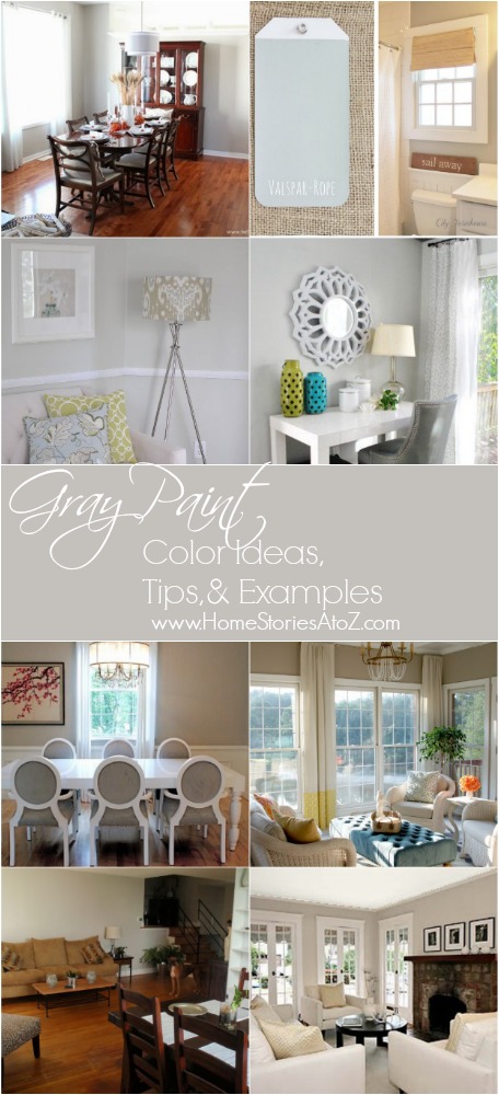
I am getting ready to paint our bedroom again. It is currently painted Sherwin Williams In Your Eyes Blue. Over the summer I purchased a new bed, bedding, and chairs (which I hope to show you soon) and it’s all looking a bit too blue. I am leaning towards painting the room gray but choosing the right shade can be a daunting process. I thought I’d take you on a little gray paint journey today to show you how I go about choosing a color for my space.
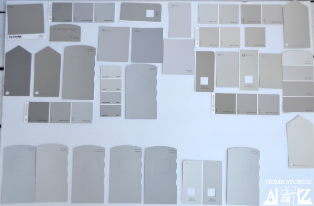
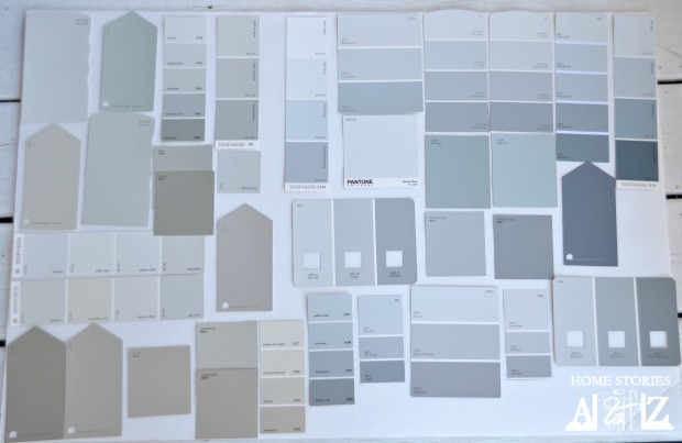
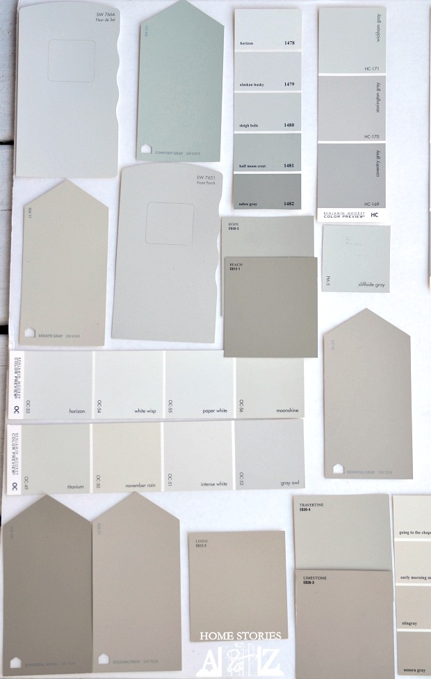
Tip 1: Gather paint swatches and organize them according to tone.
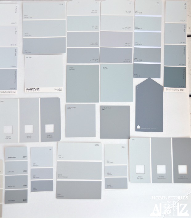
I visited Lowes, Sherwin Williams, and Benjamin Moore and grabbed all of the grayish swatches that appealed to me. (I had you all in mind when I was grabbing swatches and therefore went a bit overboard in the variety of shades I chose.) I organized all of my swatches on white foam board in a well-lit area. Doing this activity in the space you plan to paint is a great idea so that you can see how the different swatches look in the lighting of your room. You will begin to immediately see the different categories that the grays fall into. I categorized mine into four categories: Taupe Grays, Violet Grays, Green Grays, and Blue Grays.
Tip 2: Don’t get hung up on the categories. Find what YOU like.
There will no doubt be disagreements as to whether one of my categorized colors truly belongs to another category. This is besides the point of the activity. What you are attempting to do here is find what YOU think—it’s completely personal and somewhat subjective. I know that I don’t typically like grays that read “violet/purple”, so I tend to steer away from those colors. If my eyes see violet, it’s going to bug me in my space and whether or not it’s technically “violety” won’t matter. It’s what you see and have to live with that matters.
Tip 3: Don’t pay attention too closely to the paint names. Choose what you love.
You might stumble across a gray color that you consider a true blue that has the word “gray” in the name, and likewise find a great gray that has the word “tan” in the name. Don’t get caught up on the paint’s name. Instead choose shades of gray that you are drawn to.
Tip 4: Explore the colors you love in rooms online.
Taking into consideration the differences that color monitors, photo editing, and artificial and real lighting play into capturing a room’s color, I like to look up the colors I’m considering using to see how they look in others’ homes. Let’s explore each of the four gray paint categories in more detail and give real-life room examples for each category.
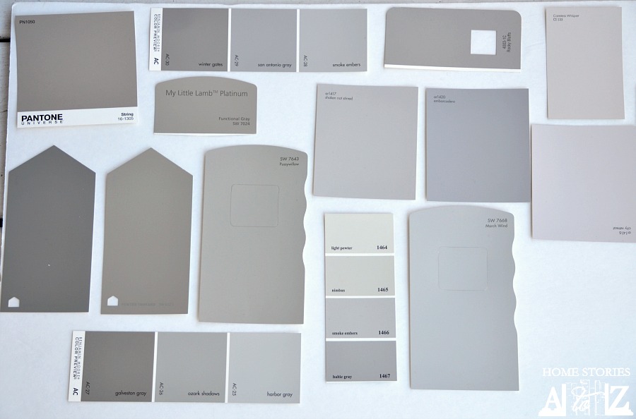
Taupe Grays
The taupe grays have more brown-tones in them and read more greige. Some of the swatches I grabbed looked very gray in the store and then completely tan once next to other grays. The taupe grays are some of my favorite neutrals. Out of the colors below, BM Balboa Mist, SW Accessible Gray, and SW Perfect Greige are my favs.

And here is what some of the taupe grays look like in real rooms…

1. Benjamin Moore Revere Pewter (source) 2. Sherwin Williams Perfect Greige (source Living & Learning with Luisa) 3. Valspar Foggy Mirror (source) 4. Benjamin Moore Cape Hatteras Sand (source)
Violet Grays
Violet grays are those that have a hint of purple and read more violet in color. Pussywillow by Sherwin Williams looks just the tiniest bit purpley to me but really is questionable in the photo below. It just so happens to be my favorite color of the ones I classified as looking violet!

1. Valspar Rocky Bluffs (source Cuckoo for Design) 2. Benjamin Moore Smoke Embers (source) 3. Sherwin Williams Pussywillow (source) 4. Valspar Pantone String shown on furniture (source Shanty 2 Chic)
Green Grays
The green grays actually fell into two subcategories for me–those that had blue-green hues and those that had more olive-green hues. Comfort Gray looked very greenish in my lighting but I’ve seen it in my sister’s home and it looks more blue in her space.
And here are some examples of green-hued grays…

1. Sherwin Williams Mindful Gray (source Setting for Four) 2. Eddie Bauer Rope (source City Farmhouse) 3. Sherwin Williams Sedate Gray (source Newlywed Mcgees) 4. Benjamin Moore Moonshine (source Young House Love)
Blue Grays
The last category of my grays are the blue grays. These read more blue than green or violet when compared with one another. Some of my favorite blue grays are Eddie Bauer Woodsmoke, Olympic Lunar Eclipse, and Benjamin Moore Misty Gray.
And some final examples for you…

1. Sherwin Williams Morning Fog (source The Spontaneous Box) 2. Olympic Going Gray (source It’s a Horvaths Life) 3. Eddie Bauer Vintage Gray on furniture (source Chrissie’s Collections) 4. Benjamin Moore Nimbus Gray (source)
Tip 5: Buy sample pots and use them in your space.
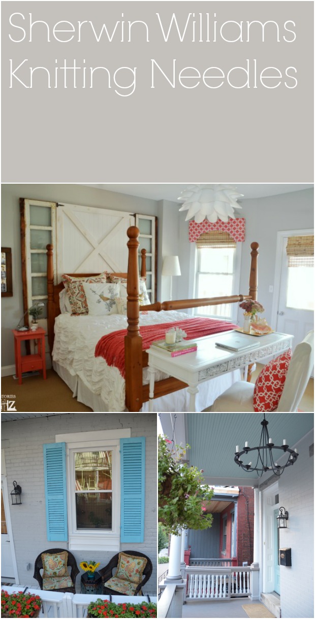
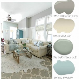
Once you have narrowed down which grays you would like to to try, it is time to test them out in your space. You can paint large poster boards in your chosen contenders or you can paint directly on the wall. Below are my current contenders and they all happen to be Sherwin Williams colors.

Knitting Needles is one of my favorite grays. I have it in my guest bedroom, back porch, and on the front of the house. It looks very different in all three spaces ,but I love it equally in each space. In my guest room it does read a touch violet to me, so I’m surprised I love it—but I do!
I hope this post proves helpful to you in your own paint color choosing endeavors! Do you have a favorite gray? If so, do tell!
I recently painted my room SW 6169 Sedate Gray and was so disappointed because it looks SO GREEN. I expected the green undertones, but id not expect them to make the whole room look green. What other colors can I incorporate into my room to make it look less green?
I’m having my kitchen cabinets painted SW Dorian Gray. Would SW Aesthetic White look okay on the walls?
Hey Ya’ll, painting whole house interior Silver plate SW7649. Living room tray ceiling accented with burgandy and one burgandy accent wall in living room. What color wood floors would look best? Accent colors? Thanks very much
I am trying to pick a gray for both the kitchen and den, adjoining rooms. I want to try gray but my kitchen cabinets are cherry and my backspash blue/green tiles with black granite counter. Do you think collanade gray would look nice in kitchen?
Hi Jenny, picking a paint color can be so challenging. My advice is to purchase a sample container of the color or colors you’d like to try and see paint a large swatch on your wall. Depending on the light in the room, the colors will most likely change throughout the day. You’ll get a better visual of whether or not gray is for you. It’s a wonderful neutral. I have Sherwin Williams Sea Salt in my kitchen which is a very light bluish gray which may work with your tiles and cabinet color.
Hello,
I am looking at your page titled grey paint ideas and there is a picture at the bottom right of a living room with 3 windows, cream sofas and a fireplace. What is the wall paint color? I love that color and was not sure how to find it. Thanks so much!
It is Benjamin Moore Cape Hatteras Sand.
Hey there! I was wondering where Dorian Grey falls into the categories? We are buying a home that has been spec’d out with dorian grey cabinets. Not sure I’m excited about that and would like to find a color palette, especially a white that looks good with dorian grey. Ugh!
I love Dorian Gray! It’s actually one of my favorite grays. 🙂 You can see it here on the main level of my home: http://www.homestoriesatoz.com/fall-2/diy-home-decor-fall-home-tour.html . The armoire in my entryway and my two dining room French cane-back chairs are also painted in Dorian Gray. My kitchen cabinets are Benjamin Moore White Dove and my kitchen walls are Sherwin Williams Sea Salt. Congrats on your new home!
arggghhhh!! I’m STILL so confused, lol! the pics you have up aren’t showing and the links seems to be taken down (I noticed tis is a post form 2013 so a lot of time has passed) but if you’re still around, will you answer a few questions? I’m going crazy with all the shades and undertones! hahaha Which grey did you use in your living room (it seems to have a slight green tone on my computer), and which in your bedroom–comes across as a true gray on my computer. My space is a tad tricky since it is a huge space divided only by a floor to peak ceiling, huge brick fireplace. I recently just whitewashed it, but lite and a sanding because I didn’t care for the chalky white. So Im looking for a gray that might compliment that, a large tan sectional and creamy whites–this is a south facing room. The other side is obviously North facing, and all creamy whites with some light taupe and very light blue accents. Hubby does not like the greige ones (wants away from our beige walls), and I don’t want the walls to look blue….i don’t think. lol Id love a fresh clean gray. which grays do you feel look best with your brick?
Thanks for pointing out that this post is wonky. I have no idea what happened to the collages of rooms I put together but the pictures appear to be broken. :-/ Okay, my favorite grays are SW Dorian Gray (I currently have this on our walls on our main level. It’s dark, rich, and does have brown undertones), SW Knitting Needles (light gray in our guest bedroom and on my house exterior–it’s a true gray), SW Mindful Gray (it is just a hair lighter than Dorian Gray and is gorgeous). Dorian and Mindful are more “greige” but they look warm and beautiful in rooms. Google the colors and check out the images tab for examples. Good luck!
thank you so much!!!!! I appreciate you responding so quickly!! I actually went to SW today and grabbed another billion (lol!!) gray paint chips. This hour I seem to be leaning toward SW Passive. my trick room calls for a color with a higher LRV. Anyway–thank you again, I really appreciated your post and response!
You’re welcome!
I am trilled to have joined your blog, since I am finally in the process of going from the tans and browns to the grays, in our beach house, like you have in you awesome home!! I have been pondering whether to paint one of my walls in the living room with an accent color (thinking of using SW Rainwashed) but now I’m thinking what you used SW Seasalt! Thanks so much for giving me the courage to try!
Ah, knitting needles is my absolute favorite color! So glad you like it too! We tried soooo many different colors in our bedroom and once on the wall they read too green or too blue. Knitting Needles was the perfect gray for the space. It is the most relaxing room now. We also made a feature wall behind our bed to break up all the gray. Just on that one wall we painted wide gray and white horizontal stripes. It looks even better than I had hoped!
I’ve also been on the hunt for my perfect greige. I bought 10 sample pots and decided on Grant Beige. It’s a warm, neutral beige with gray undertones. I was disappointed in Revere Pewter looking more gray than I had hoped. Anyway if anybody’s on the hunt check out Grant beige by Benjajmine Moore too.
Great tip! Thanks for sharing!
These are great tips. My husband and I recently painted our master and I had so many blocks of samples painted on our walls. I swear I thought I would have “50 shades of gray” on our wall before I picked the perfect color. Luckily it didn’t take that many and I was FINALLY able to pick the perfect gray for our space. We decided on Behr Ashes. Those little sample pots are worth every penny!!! I HATE having to repaint because I decided on the wrong color!
I completely agree! Repainting an entire room is no fun. And LOL on the 50 shades of gray on your wall ;)!
This is a great idea. I have been trying to figure out how to select paint color in a new home where every wall is snow white. Thank you for the idea of using the board. And wishing I had your talent!
Glad to be of service Myrna! Thanks for visiting me :).
I soooo needed this article about 2 months ago. I put over 18 color samples (actually painted a swatch) on my breakfast nook wall and ended up not really liking the one I chose. Blue/gray is soo hard to decide since lighting has a huge impact. Plus having the entire wall painted changes it too.
What color blue/gray do you have in your kitchen? Also, did you paint your island? I have the similar “orange” cabinets and need to change something up.
Love your site!
sorry, thought I was on the sand/sissel sight. But now I’m going to watch this one, it’s great!
Ha! Kim from Sand & Sisal is my big sister. The color of her kitchen is Sherwin Williams Comfort Gray. 🙂 She did paint her island black a few years ago. Thanks for visiting me Mona!
Beth, thanks for sharing about all these grays! Quite a project. When you show your room reveal, please tell us how you like your new bed. Sleeping better? Comfy? Hot? Thanks again, Vicki
Beth, I love your home. It is so bright and cheery 🙂
I have SW pussywillow gray in all my bedrooms and I’m surprised you placed it in the violet category! It doesn’t have the slightest hint of voilet in my house. It seems to have an almost green undertone. I also have SW North Star, Dovetail, and Repose Gray in different rooms but I think the pussywillow is my favorite…
Yes, that stood out to me in the photo as being misplaced as well. So funny how colors look so different in different settings. In my bedroom it blended right in with the violets.
This couldn’t have come at a better time. I’m getting ready to paint my bedroom and want to either go with grey or white (gasp!!). I have color throughout my house and want to go this route in my bedroom so I can switch up the accessories if I get bored and want more color.
I have one question: what is the best source for bedding? I’m searching for something with navy blue but I’m having difficulty finding a good source. Thanks.
I like to just google “navy blue bedding”, hit the shopping tab, and go from there. HomeGoods, Marshalls, TjMaxx are my favorite discount places. Macy’s, Nordstroms, Pottery Barn, and Anthropologie are my favorite non-discount places.
I love gray paint. In fact, I really wish that I had a light gray as the neutral paint color throughout my hallways and staircases instead of beige. Maybe someday… But I totally agree with you that choosing grays can be tricky with all the different undertones and how differently they can read in natural light by day versus artificial light by night.
I do have two favorite gray paint colors that we’ve used in our house! The lighter of the two is medium grey that we used for our basement – Glidden’s Granite Grey. The other is a charcoal gray from Kwal that the builder of our house had used on a couple of accent walls, but which we liked so much we used it for our guest bedroom (http://www.blueistyle.blogspot.com/2013/07/HoneymoonInspiredGuestRoom.html) and bathroom (http://www.blueistyle.blogspot.com/2013/07/HoneymoonInspiredGuestBathroom.html). Unfortunately it doesn’t have an easy color name, just a number – Kwal AccuTone CL-3236A.
Good luck choosing a gray you’ll love!
Thanks for the color shares Angela!
Great post, Beth. You’re right, grays are definitely tricky, and I find that a room’s particular lighting plays a huge role in how they read. Here are some of the grays I’ve used in my home: BM Revere Pewter (my all time fave), BM Silver Fox, BM Coventry Gray, and most recently BM Soft Chamois in our bedroom. It’s very light – almost creamy – and I LOVE it! Good luck with your bedroom makeover! ~Kerri
Hi Kerri! Revere Pewter is a top contender for my hallways. They all need repainting. I’m going to check out Soft Chamois. I’m doing a plank wall in white and the other two walls in gray (with our last wall as the exposed brick). I’m not sure I want too much contrast between the plank wall and the painted walls so your color might be perfect. Thanks for the suggestion!
I’m in the process of un-beige-ing my home, so this post is very helpful. I plan on researching some of the shades here!
So far I’ve used SW Gray Shingle and I love it, as seen here in my home office: http://coastalpines.blogspot.com/2013/10/hutton-home-office-orc-week-two.html