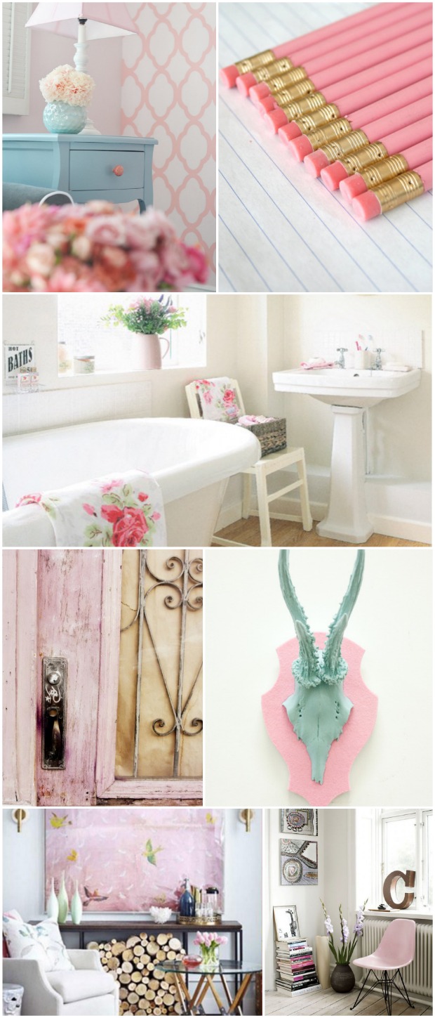
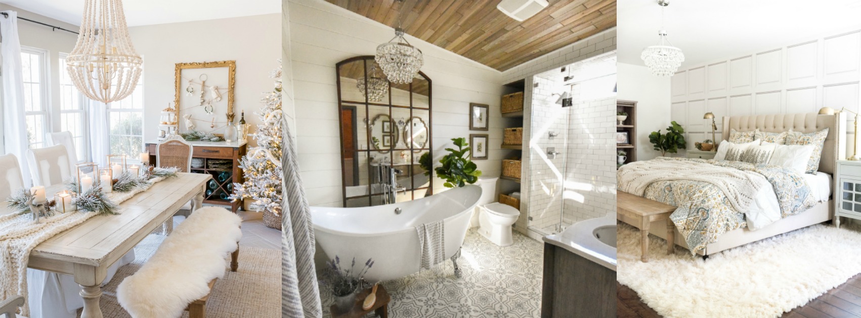
Pastels have taken over fashion this spring and are predicted to make an appearance in home decor in 2014. As I type this post with patches of dirty snow still on the ground, I find the idea of painting my surroundings the soothing shades of easter eggs perfectly delightful! I am so very ready to usher in spring and be done with the dreary grays and browns of winter. Let’s explore some ways to use pastels within the home!
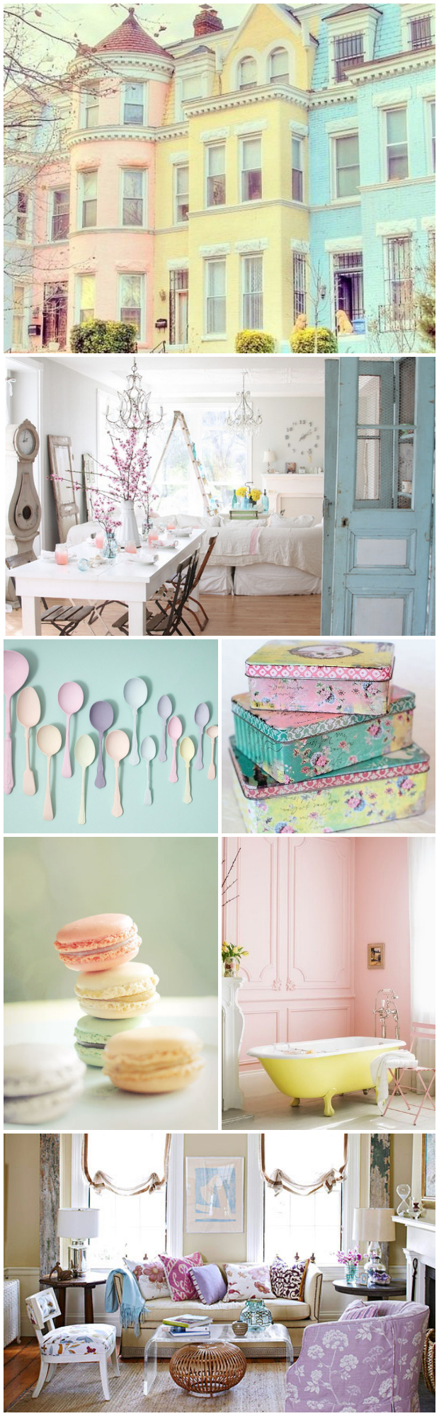
Image sources: 1. Unknown 2. Dreamy Whites 3. Rebecca Newport 4. Unknown 5. happeemonkee 6. Unknown 7. BHG
I like my pastels surrounded by LOTS of white. When there are too many pastels going on in a room at the same time it begins to feel too “80’s” to me. Notice how the following pictures all show pink chairs surrounded by a lot of white. Perfect!
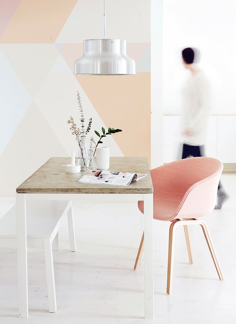
Image source: Weekday Carnival
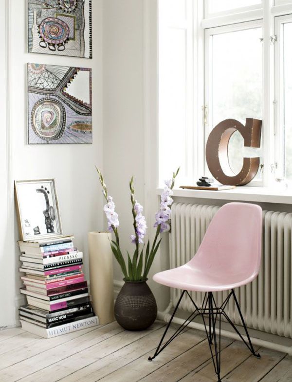
Image source: Original unknown
Image source: Yvestown

Image source: Fry Dog Design
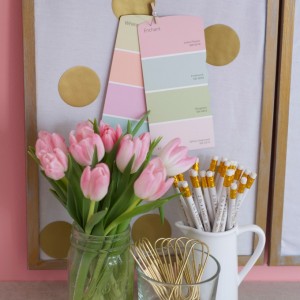
And because I’m in a girly-pink phase right now, I couldn’t resist including some more pinkspiration.
A fun way to incorporate pastels into a dining room is to paint each chair a different pastel color.
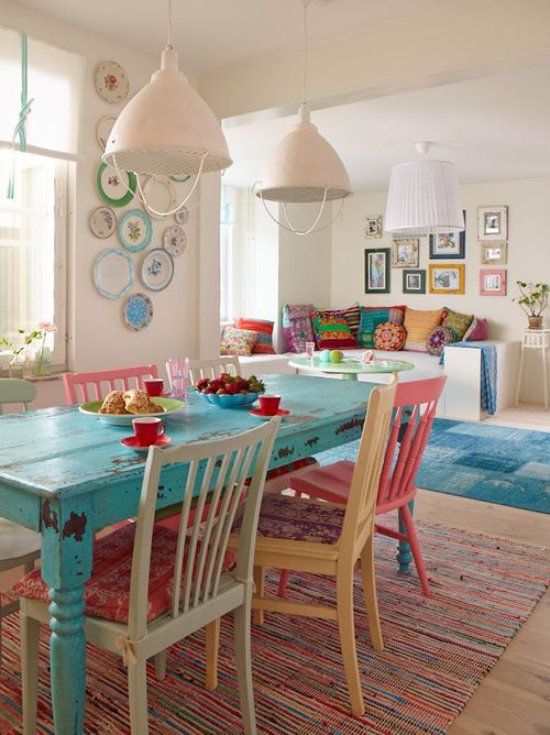
Image source: Original unknown
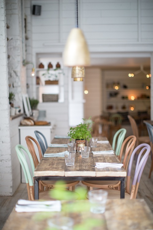
Image source: Hally’s
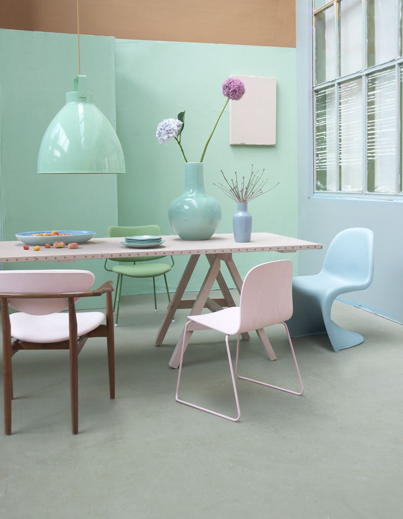
Image source: Vtwonen
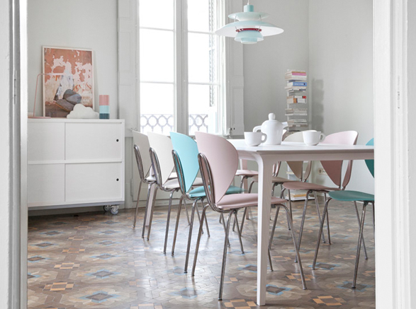
Image source: Nest.co.uk
Many of the pictures in this post are from Scandinavian sites. They are ahead of the game when it comes to using pastels in the home. One artist that I stumbled upon in researching pastels is Pernille Snedker Hansen. She is amazing! She drips paint into a large, shallow basin of water and then dips raw wood into the marbleized paint to create wood flooring. I have no idea how the paint adheres to the wood but the end product looks like some DIY’ers seriously need to figure it out!
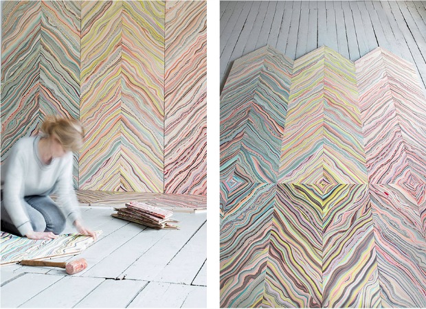
Image source: Snedker Studio
And I’ll end our pretty pastel tour with the pastels I’m most comfortable with–blues and mints!
Image: Country Living
Image source: Unknown
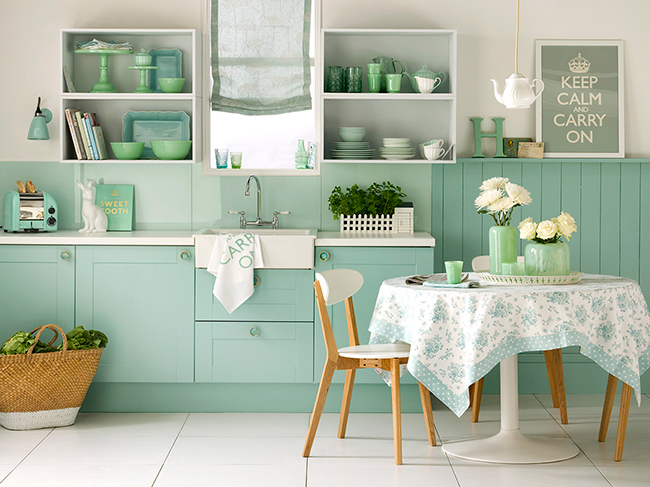
Image source: via The Relaxed Home
Image source: Home Designing
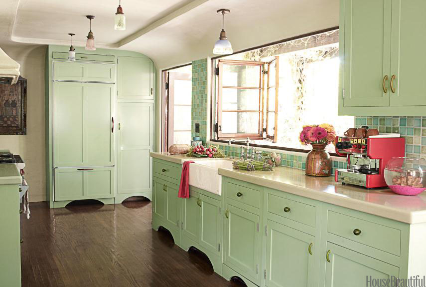
Image source: House Beautiful
What do you think about using pastel colors in the home? Yay or nay?


I love pastels Beth!! Such pretty inspiration.
You have one dining room in there – source unknown. That was my inspiration picture for my dining room on a post I did last year- I originally saw it on House of Turquoise but the original source for it is:
http://sannaochsania.blogspot.fr/2013/06/med-farg-i-fokus.html
~ Krista
Awesome! Thanks for sharing the source!
What a feast for these tired winter eyes your pastel post was…beautiful rooms and such soft refreshing colors. I’ve been drawn to pastels lately too…just painted a bedroom in BM Quiet Moments, a very soft gray blue…love the results with pastel green and soft yellow accents. Thanks for sharing. Cheryl
Yah!! And hooray!!!
That top photo looks like it might be Rainbow Row in Charleston , SC?
I am so pleased to see you and this posting today! What could be happier than pastels? You have the Best taste, so next time I redecorate, this is how I’m going! Thanks!
Thanks so much Linda! Happy weekend :).
The very reason I have my walls painted a very basic antique white is so that I can change so many things about my decor by the season. Winter and fall I tend do go with rich colors in my pillows and slipcovers. Spring and summer I am a girly girl with lots of pastels – mostly pale greens and pinks. I have one wall in my living room on which I display a quilt. I always makes me happy to put up my flying geese quilt that is all pastels and white. That’s when I feel like spring has actually arrived…regardless of the goofy weather!
Yes! A white, or neutral-colored room, gives you a great blank canvas that allows for so much more flexibility to decorate with the seasons.